
But I’m more likely to share gloomy visuals.
The “most depressing” chart about Denmark, which shows a majority of the population lives off government.
A “very depressing” chart about the United States, which shows how big business profits from cronyism.
The “most depressing” chart about Japan, which shows that the tax burden has nearly doubled since 1965.
Now it’s time to add to that list. There’s a website called “Our World in Data,” which is a great resource if you’re a policy wonk who likes numbers. But some numbers are quite depressing.
For instance,if you peruse the “public spending” page, you’ll find a chart showing the dramatic expansion of redistribution spending as a share of economic output.
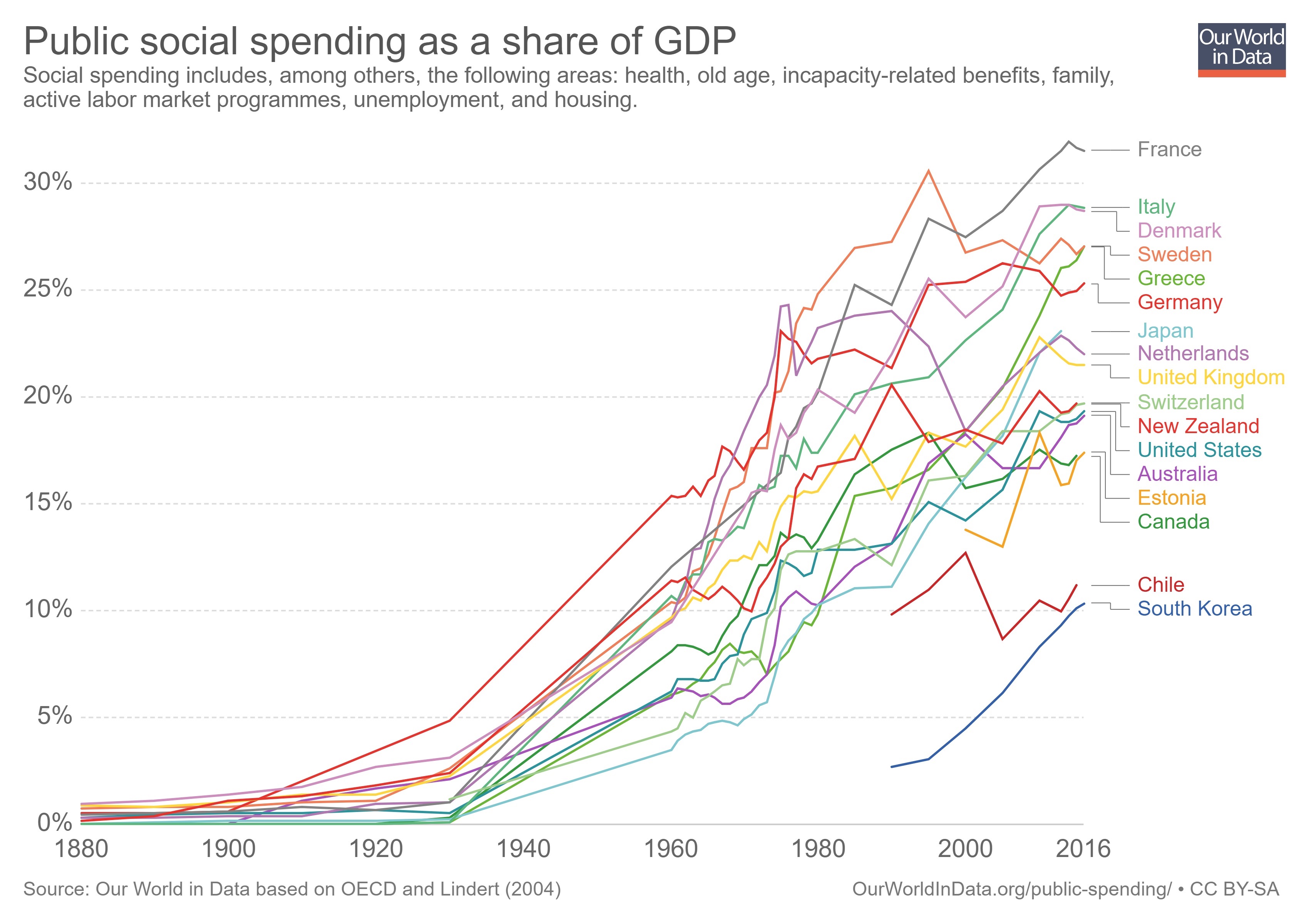
These numbers are very similar to the table I shared from Vito Tanzi back in 2013, which isn’t surprising since Professor Peter Lindert is the underlying source for both sets of data.
While the above chart is depressing to a libertarian, it’s nonetheless instructive because it confirms my argument that the western world became rich when government was very small and redistribution was tiny or even nonexistent.
For instance, nations in North America and Western Europe largely made the transition from agricultural poverty to middle-class prosperity during the “golden century” between the Napoleanic wars and World War I. And that was a period when redistribution spending basically didn’t exist and most nations didn’t even have income taxes (the U.S. didn’t make that mistake until 1913).
